How to increase performance with colours
Colours are incorporated into our society: look around at the street and you will notice warning signs and traffic lights in bright colours. Colours have a bigger impact on humans than you may think. They affect feelings, behaviour and attention. Therefore, understanding how colour can affect human perceptions and behaviour is essential for providing the right colour that can help creating an efficient work environment.
The history of colour psychology
The history of colour psychology started long ago. To accomplish holistic benefits, Egyptians studied the effect of different colours on moods. In the 17th century, the study of colour became more prominent. Isaac Newton observed sunlight passing through a glass prism and saw the reflection of various colours. He identified six colours and added one later: violet, blue, green, yellow, orange, red, and later indigo. More recently, the Swiss psychologist Carl Jung, did further research on the influence of colour. He calls colour the “mother tongue of the subconscious” and it led him to develop art therapy.
Should we ask users for their colour preference?
As a result of most cross-cultural studies (Savavibool, N., et.al., 2018), blue and green are consistently found to be the most favourite colours. White seems to be the most favourite neutral colour and people say they prefer to work in a white environment. But white has demonstrate not to be the best colour for working: Jean-Gabriel Causse is reporting a case in England, where classrooms that were beige were repainted pink and children's drawings before and after were compared. It was found that since these classrooms have this color, there are more suns, fewer clouds, etc. He also says that in occupational medicine, for example, we realise that the worst colour to work in is white. Because with white walls in our offices, the risk of burn-out is higher, productivity is lower, we get bored and are less creative. Today, about 8 out of 10 people in France have white offices.
Which colours have a positive influence on our mood and emotions?
The emotional responses to colour are related to the meaning of colours. Some colours have a greater impact on heart rate than others (Savavibool, N., et.al., 2018).
Green for concentration
Ever noticed that walking through a green forest provides you with a calming effect? Green evokes the most positive emotional responses. Green is associated with relaxation, hapiness and stimulates concentration. Implementing the colour green into a classroom or a work environment encourages efficiency and focus. This colour is great to improve long-term concentration and clarity.
Blue and green are associated with a sense of wellbeing. The cool workplace colours would enhance creativity, supporting the people to think and generate ideas.
Blue for creativity
Psychologically, blue is calming and reduces tension and fear with on the other hand, the inconvenience of having a drowsy and sleepy effect. Studies show that the colour blue is best used for challenging learning situations. Adding some blue ink of blue paper can even improve reading comprehension. The colour slows the pulse rate and creates a sensation of space. Adding bright colours such as orange to bring an extra kick and highlight information might be needed.
Red or orange for the energy
The red environment can be perceived as stimulating as well as distracting. Orange feels welcoming and can lift the mood for learners. This promotes comfort and improves neural functioning. In classrooms, the colour orange can be a little too much for people who are young and energetic. It can overstimulate your audience if wrongly used. Orange should only be applied in small doses, for example to highlight important information as mentioned before.
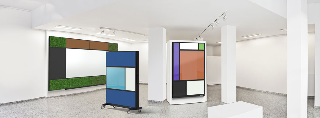
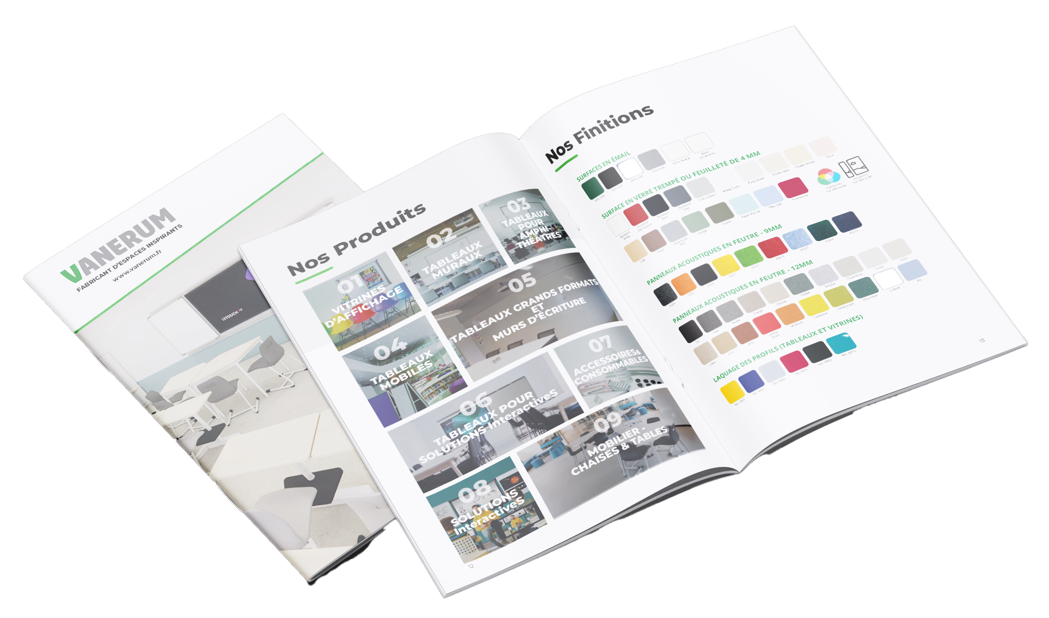
Mondi Collection : the solution to create the perfect customized colour combination adapted to your needs.
Find the right combination of colours to motivate your team and achieve your objectives
Even if some studies report both consistency and contradictory results, strong evidence is now established that workplace colour plays a significant role on mood, physiology, wellbeing and performance. Understanding on one hand that culture, gender, age and background may influence the perception of workplace colour and colour preferences and on the other hand, that a user/department may need to concentrate, be stimulated or energised during the same day or week, the answer probably lies in a combination of all the colours in the different spaces of the company.
Many boards can be customized so you can add your own style to create a workspace that looks and feels like you. Take a closer look at the GLASSBOARD and MONDI collections that are perfect answers to all your colour needs.